….More blue than black
A soft black with blue undertones
More blue than black, Railings is a softer alternative to black which is particularly suited to the ironwork it takes its name from. When used in Full Gloss on front doors it creates a handsome and commanding entrance, but becomes much more relaxed in feel in an Estate Eggshell finish. The bluer undertones of this dark hue transform rooms into dramatic and enveloping interior spaces.
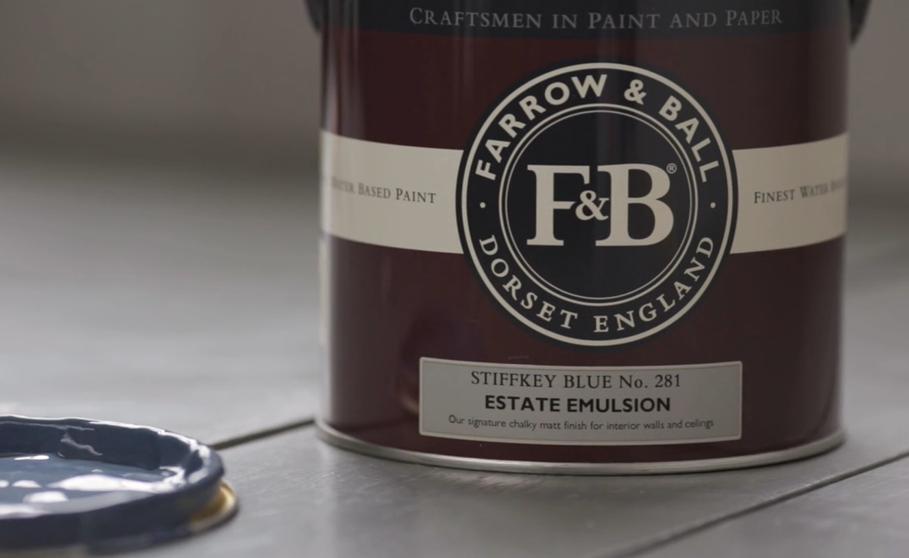
…The inky blue
An inky navy
This inky blue is named after the Norfolk beach where the mud, along with the cockles, share a particular deep navy hue. Although traditional in feel, Stiffkey Blue is often used as an alternative to Down Pipe to create a richly dramatic space with a more contemporary finish. When used in well lit areas of the home it will appear much bluer, working wonderfully when contrasted with Ammonite.
…An easy neutral
An understated grey
Cornforth White is the mid tone in the group of Easy Neutrals which are totally understated and extremely versatile. Neither too warm nor too cool, Cornforth White sits contentedly between Ammonite and Purbeck Stone to create a hushed and calming retreat. Named in memory of John Cornforth, the revered architectural historian, contrast with Wevet to enhance its grey qualities.
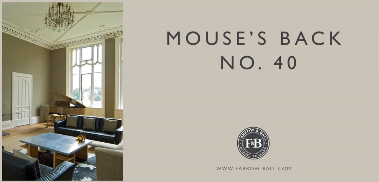
…A classic grey brown
A quiet grey brown
This grey brown classic takes its characterful name from the fawny colour of the British field mouse. Much like its namesake, the green based Mouse’s Back is quiet in nature and feels soft in rooms both large and small. It will read greener when used on the walls of underlit rooms and is the perfect accent on furniture or floors when combined with more traditional shades such as Setting Plaster and Lime White.
…Bright and contemporary
A modern crimson
This bright and modern red takes its name from the distinctive crimson leaves of Italian chicory. Although tempered with magenta, Radicchio contains less blue pigment than Eating Room Red so is brighter and more contemporary in feel. It confidently fills a room with energy without having the brashness of a true, clean red.


